First, the Sacrilege! This is, by far, the baddest ship in Eve Online, as far as I'm concerned. It is also, obviously, the inspiration behind the Adamant. =D It makes the Adamant look silly and amateurish, as far as I can see, but oh well.
The model was imported from the game itself. It's been a bit of a challenge getting all the textures and whatnot to look right, and I've still got a little bit to go before I get it perfect. Obviously, I didn't make it, and it's really got no place here for the most part, but I just thought I'd put it up to show off that I haven't been completely lazy. =)
The second is something I've been working on for a LONG time. This is the model Paul Trenkler made of the Enterprise-E, the awesomest Enterprise, by far. =D It was originally modelled in Rhino, and then saved in .max format. I had to download a trial version of 3DSMax just to get to open the file. And then to export it took a bit of tinkering, which I actually can't remember even how I did.
Then, of course, there was importing it into Blender. Keeping in mind, this is back in the day when Blender was still around 2.3x, and I was using a Pentium 4, it took all night to convert the .3ds file into .blend. In the morning, imagine how thrilled I was to see Paul Trenkler's Sovereign, a ship model I had drooled over for a long time, sitting there, ready for me to play with. =)
Then came the arduous process of texturing the thing. This is the result (in Blender Internal):
And here is the Cycles version, which, in turn, calls on me to once again, completely re-texture!
Finally, since I feel that scale comparisons make things more interesting, and more real, here is a scale comparison of the Sacrilege from Eve Online and the Sovereign class starship from Star Trek.
What do I like to see in spaceship design? I like sleek, masculine designs, which are unorthodox, and are powerful looking. However, I believe that all machinery and vehicles ought also to express an artistic flair to them. The finest cars, I feel, down through history have been those that stand out stylistically--smart, beautiful lines and fascinating curves which look good from many angles. I appreciate Lamborghini more than Ferrari, not because they are necessarily better built cars, but because I like the more sinister edge the Lambo designs have.
To me, the Sacrilege and the Sovereign represent the pinnacle of spaceship style for much the same reasons:
- Outstanding. They are not ordinary rocket ships. They are not ordinary saucers, and they do not follow the general conventions of general spaceship design. The designers realized a true, space-borne vessel can look like anything, since there is no atmosphere or any other like encumbrances which stand in the way.
- Visually Interesting. They started with bizarre extremes: the Sacrilege's deeply dipping nose. The Sovereign's extremely long and thin profile. These things feel daring, as neither of these design elements are particularly necessary and are not the first thing you think of when building a spaceship. But they define the sense of the craft, and give it the marked personality which sticks with you.
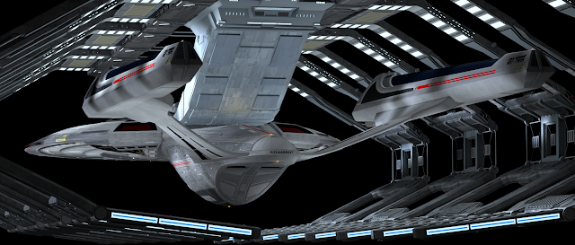
- Menacing. Both ships look threatening. They look as if they could hurt you, and you wouldn't want to be facing their might head on. One of the most powerful visuals in Star Trek movie history is this shot:
Someone's in for a world of hurt. Aren't you glad it's not you? When these ships are angry, you know it. They bristle with power and menace.
In the end, this is what I love about these particular designs of starships, and what I would love to be able to produce on my own, had I the talent of the artists who designed the Sacrilege and the Sovereign.
Dan


